Art Madrid'26 – Alberto Corazón in Telefónica Foundation


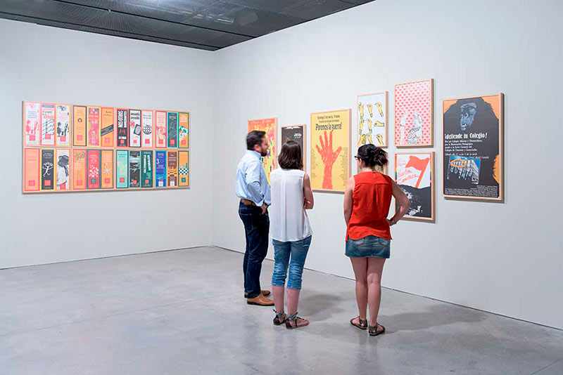
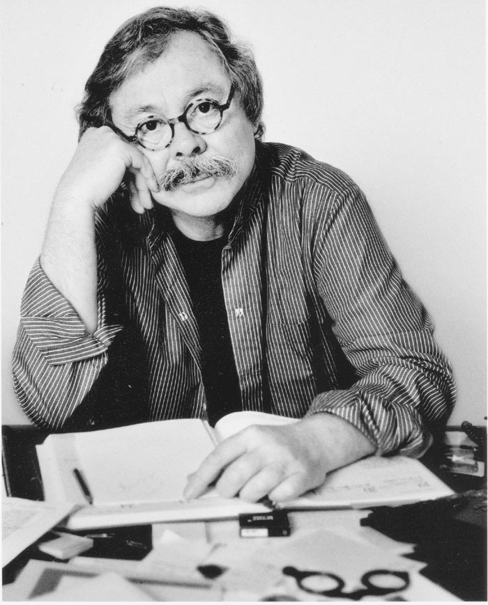
Alberto Corazón, the most important Spanish artist and designer of our time shows his prolific career in the exhibition "Alberto Corazón. Design: The energy of graphic thought.1965-2015" , which can be visited in the Telefónica Foundation Space until 4 October.


Alberto Corazón (Madrid, 1942), painter, sculptor and designer, is one of the Spanish designers with more international projection. Corazón is important in the fields of graphic and industrial design, and he has received numerous awards (Arts Director Club of New York, the British Design and the Design Council International). In 1989 he received the National Design Award, and he is the only European designer with the Gold Medal of the American Institute of Graphic Arts.


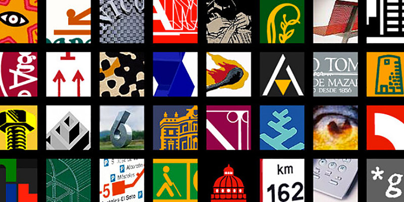
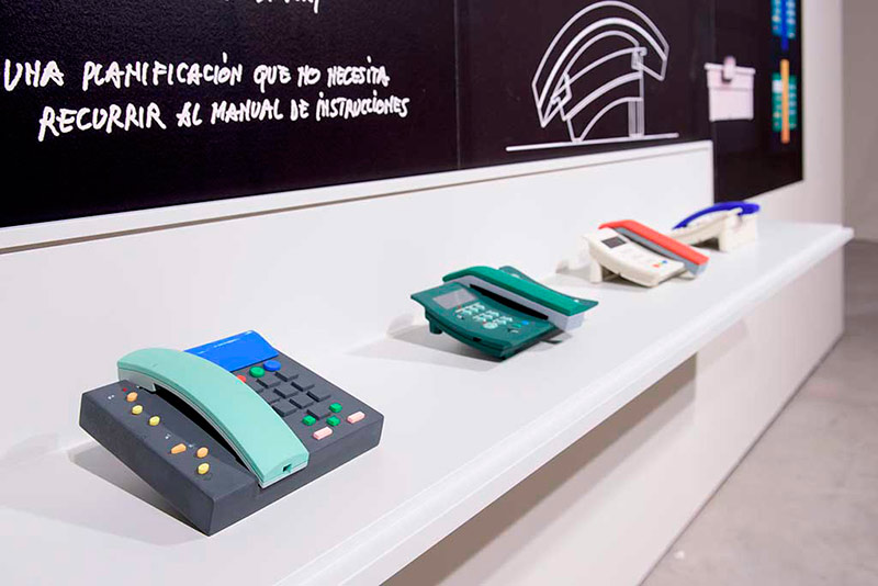
The exhibition shows the creations of the artist and graphic designer from the 60s of last century to the present. Ana Arambarri, curator of the exhibition, has assembled a selection of works that are already key symbols of the Spanish culture: 132 posters, 115 images and sketches, 145 logos, objects and models. Pieces and art works that are recognized in the imaginary and the cultural memory of our country (Casa del Lector logo, corporative image of RENFE, sketches for the Phone Domo or posters for the Autumn Festival of Madrid, among others). The exhibition includes some films and audiovisual material, reinforcing the concept of design as a crucial ingredient for innovation and creativity.


Alberto Corazón considers designing as an intelligent activity, the result of reflection and thought, and he believes that excellence in this profession is on neurons, never in computing resources. In fact, the artist says: "The risk of design today is to forget about the functionality and accept the weight of aesthetics. In recent years, the computer mouse has replaced the pencil and nothing can be as before. In every sense, conceptually and formally. "


Several workshops for children, youth and adults related to the design, will be held alongside the exhibition. Within the sample itself, there will be an educational space, "The design calls you", in which the visitor can be converted, through a series of activities, in an authentic designer. In addition, on 17 and 22 September will be held two meetings with Alberto corazón, in which the artist will talk about different professional design and communication.


ART MADRID’26 INTERVIEW PROGRAM. CONVERSATIONS WITH ADONAY BERMÚDEZ


The pictorial work of Sergio Rocafort (Valencia, 1995) is articulated as a field of questioning rather than a system of closed visual statements. His paintings do not seek to close off meaning, but rather to activate an open perceptual experience, in which the viewer participates in a critical exercise of reconsidering the ways of seeing, interpreting, and conceiving painting in the present. The image thus presents itself as an unstable territory, where perception constantly oscillates between the visible and the imagined, and meaning is constructed in a provisional and shared manner.

One of the structural axes of his work is the tension between scale and intimacy. The format functions as a relational device, alternating physical immersion with concentrated attention, generating an expository rhythm that prompts the viewer to move around, approach, and withdraw. This spatial dynamic engages with a painting situated on the threshold between figuration and abstraction, sustaining a reflection on painting as both window and physical object, while emphasizing its material and spatial condition.

Rocafort’s creative process is also grounded in a dialectic between intuition and control. Far from a romantic notion of chance, the unexpected is understood as guided pictorial thinking, in which every decision—even those that appear accidental—responds to a critical awareness of the act of painting and a progressive refinement of the means of expression.


Untitled. 2024. Oil on panel, 30 x 45 cm..


Questioning seems to inhabit your painting. What kind of questions do you want your work to pose to the viewer?

Generally, my intention is for the work to provoke more questions than answers. Ultimately, I believe my work refers to shared spaces that nevertheless remain open to interpretation. I think that this interplay of questions—questions that arise for me as an artist in the studio—is interesting when it is later transferred to the viewer in the exhibition space. These questions usually concern the way we look, the way we interpret, and the way we conceive painting. It is a constant game between what we see and what we imagine.


Untitled. 2025. Oil on linen. 32.5 × 22.5 cm.


Your works seem to constantly stretch scale, moving from the intimate to the immersive. How do you decide what format each investigation requires?

I believe the main reason I choose one format or another depends on the exhibition installation. Beyond how each individual work functions, I think it is the overall vision that completes the project and gives it coherence and meaning. In many cases, these contrasts arise because a small work encourages an intimate approach, while a large work can have a stronger impact. Ultimately, this play of tensions causes the viewer to move closer, step back, and generates an interesting dialogue within the exhibition space itself.

In my case, I tend to work quite a lot with large formats because of the impact they produce. I believe there is a kind of translation that takes place—one that extends to the tools themselves—and this allows for greater expressiveness and a stronger impact on the viewer.


Untitled. 2015. Graphite on paper. 80 x 65 cm.


Critics often highlight your attention to proportion and detail. How do these concepts operate in a painting that resists figuration?

I do not think my painting resists figuration; rather, it constantly plays at its edges. Most of my references are figurative, but I seek to continually tension the relationship between volume and classical notions of pictorial construction, without losing the idea of the painting as a window—or rather, as an object. This relationship between painting-as-window and painting-as-physical-object is fundamental in my work; both aspects share common ground.

The result would be very different if one of these elements were set aside. But the game is not only formal: it is about generating ambiguity, creating a point at which the viewer must complete the work. I believe this operates both in hyperrealist figuration and in geometric abstraction, which is what I have been working on recently.

Abstraction allows me to detach completely from the image. In fact, I do not work with photographs or a predefined imaginary; instead, I generate my own notion of volume and space without relying on a prior model. Ultimately, even if I do not start from a figurative reference, this freedom coexists with the basic principles of painting. Neo Rauch, for example, does not need a maquette or a photograph, and I believe that same freedom is present in my work without abandoning those fundamental notions of painting.


Untitled. 2025. Oil on linen. 32.5 x 22.5 cm.


In your relationship with black, contrast, and chromatic vibration, how do you decide when a chromatic tension should be restrained or emphasized?

I think something similar happens here to what occurs with formats—it largely depends on the exhibition space. A painting can be small yet possess great chromatic force and a high level of contrast; even if it alludes to intimacy, it can generate a strong visual impact. In a larger format, the opposite may occur: low contrast or subtle nuances may function better. Everything depends on the relationship established between the works in the exhibition space and on how we want to bring the viewer closer or push them back in order to generate visual tension. In my work, synthesis, clarity, and the depth offered by color and material have always been present. I increasingly try to limit my resources so that the work functions with the bare minimum. Lately, for example, I have been drawing a great deal and working almost entirely with monochromatic ranges, because within that simplicity I believe many nuances can be explored and revealed—transparencies, density, contrast. This is, in essence, the chromatic game in my work.


To what extent do you plan your work, and how much space do you leave for the unexpected—or even for mistakes?

I have always thought that I leave a great deal of room for error and chance, but lately I believe less in that version of the creative process. I think there is always a reflection and a guiding hand behind these “accidents.” I do try to allow unforeseen things to happen, but what emerges I would call intuition rather than chance, and I try to embrace it and guide it. This is, essentially, my way of understanding painting.

As for how I manage the timing of my projects, toward the end of this year I have a solo exhibition planned at Shiras Gallery, which will be a good moment to consolidate the works I have been developing and their visual impact. Recently, I have also been focusing on Art Madrid, which is approaching, and I am seeking for the exhibited works to have a cohesion, coherence, and clarity that some earlier works lacked. This time, the luminosity and saturation present in parts of my work shine more than ever, and I trust that the gallery will achieve a very successful exhibition installation at the fair.