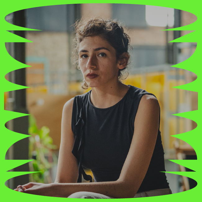
MANU IRANZO: ON THE TRANSCENDENCE OF DRAWING
Jan 31, 2024
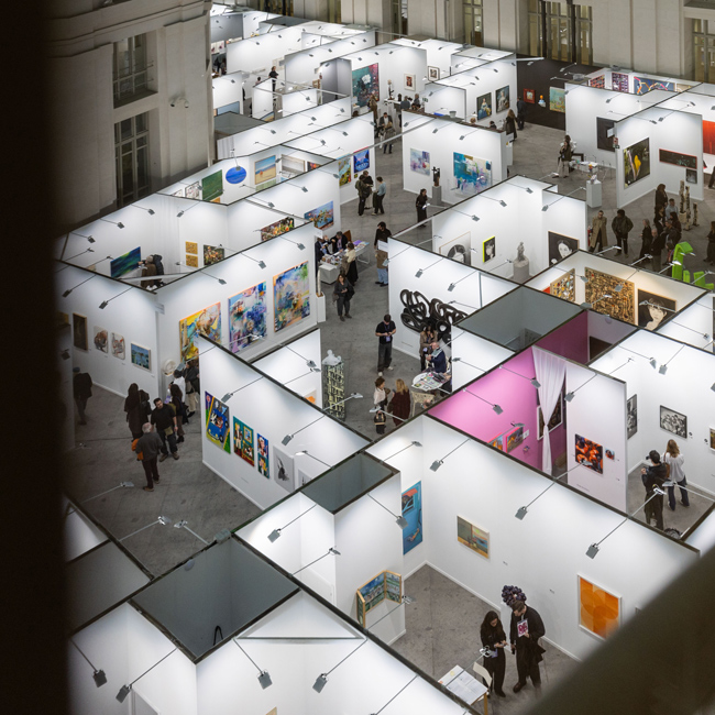
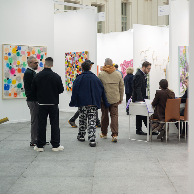
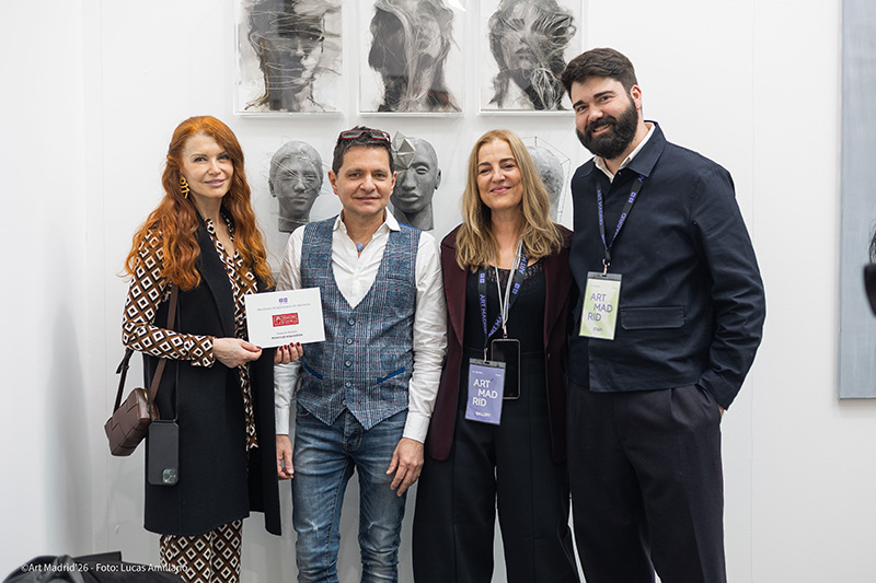
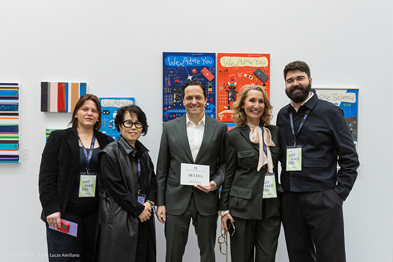
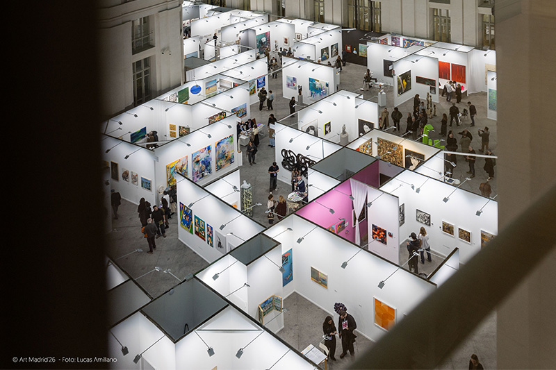
art madrid
ARTE & PALABRA. CONVERSATIONS WITH CARLOS DEL AMOR
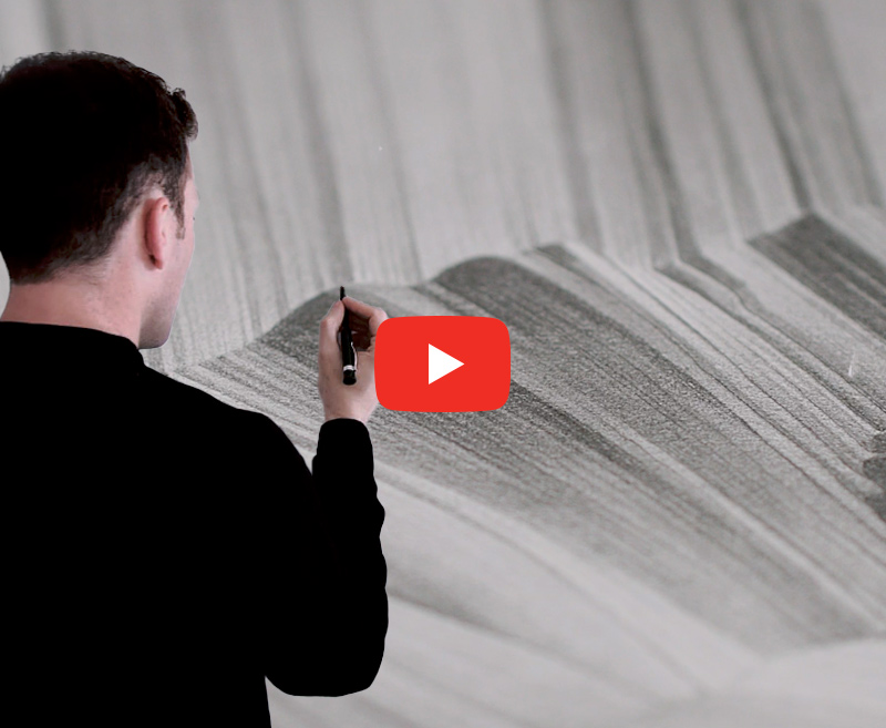
There is a strange sensation when you stand in front of a work by Manu Iranzo (Teruel, 1983), you don't know if what you have in front of you is real or if it is some kind of intermediate layer between what we think we see and what we really see. It is as if his meticulous graphite drawings came out of the dream from last night. His work, I feel, moves in that diffuse plane that borders the existing boundary between what we think we have seen and what we have really seen.
Do the test, look at a sea, a flower or a cloud, then close your eyes tightly, that sea, that flower and that cloud remain, but in a different way, they are already a very close memory, but impossible to return, nothing will be the same when we open our eyelids. What we see when, paradoxically, our eyes are closed is very similar to Iranzo's drawings. It is the moment frozen and remembered of something that will never exist as we saw it. Its origins in design can be appreciated, although I feel that this is like the famous riddle, we will not know which came first, the drawing or the design. I say that the influence of this other facet is evident because a designer must be specific and observant, and this capacity for observation is often carried out far from the terrain on which he will later work, and it must be something like closing one's eyes and catching the moment, a step before sharpening the pencil.
If you had to define your art in one sentence, what would it be?
The affirmation of balance, order and detail.
Looking at your social media, it says: "drawing and design", is that the right order?
There is no fixed order, I see it more as an indivisible, inseparable whole. It is the same look for the one who draws as for the one who designs, as both are completely complementary creative disciplines. The working environment/ecosystem may change, whether digital or analog, but the perception is the same.
I am aware that in design there are problems to be solved with a purpose/function for a specific client and specific needs. Drawing, on the other hand, enjoys a greater autonomy, in addition to being an emotional and personal expression, it also requires a final viewer with whom a conversation is established. I think that both fields drink from each other, sharing resources in both directions.
It is said that art poses questions and design offers answers. Drawing is subjective and can evoke different interpretations, while design has to communicate its message in a more direct and specific way.
I mean, how does your facet as a designer influence the drawing?
The way I approach the project. When I approach the work, I try to ask myself questions as if it were a client's briefing; to see what needs I have to cover. I try to answer these questions from the conceptual to the technical part, the possible route of the series, the technical complexity or the estimated time of execution.
I also consider that this designer's point of view has a direct influence on the way I compose the elements in the work. There are similarities when I layout a poster or a book, how the typographic compositions interact with the images, how they "stain" in short.
On a technical level, all the sketches that precede the final work are done in the digital environment. It is on the computer where I begin the sketching phase, where I establish formats and dimensions, so that when I move on to drawing, I already have a clear idea of how it will look. On the computer I can see very well how the work will look as a whole, if it will work. I don't usually improvise at the last minute, although I do improvise on some details of tonal evaluation or finishing in certain parts of the work. I try to be concise. I think that discipline in the process comes directly from the design world. It helps me to be more specific, to eliminate the superfluous.
Another aspect I would like to emphasize is how the trend in design influences the artistic work, as an inevitable consequence of the context that surrounds us.
Where does reality begin and where does fiction begin in your work? Where does the tangible begin and the dreamlike begin?
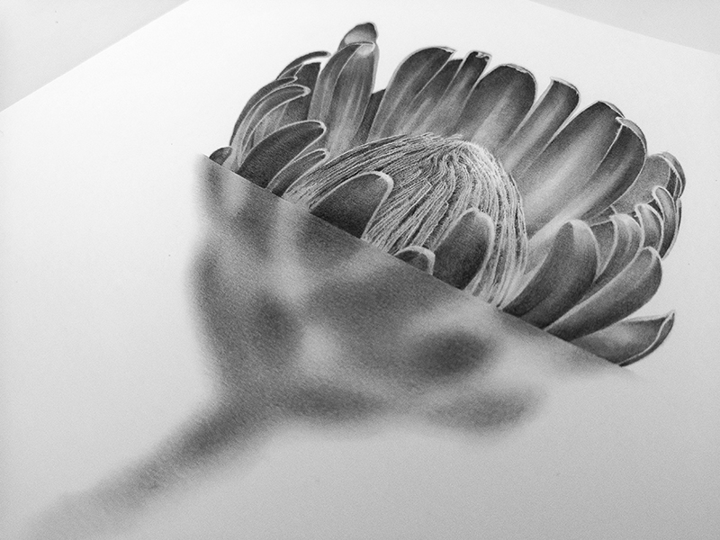
Reality begins with nature itself, the recognizable image. Fiction comes from the fusion of these identifiable natural elements with subjective interpretations. In my work Mar Interrumpido or in the Botánica series I experiment with the formation of the image, an effective treatment of blur creates an atmosphere that leads the viewer into the realm of interpretation, into a more psychological section.
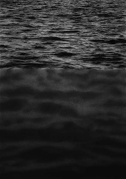
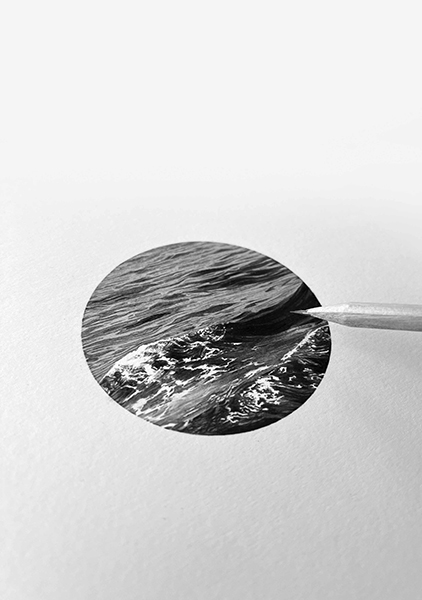
Another element that I think influences and plays an important role in this concept of reality/fiction is the scale, the actual dimensions of the work. Introducing a sea with a diameter of eight centimeters or making clouds in a vertical format of more than two meters high. There is a different degree of intimacy, of contemplation of the work, one invites the approach and the other needs an inevitable space.
The dreamlike result is also linked to the monochrome technique itself. The absence of color leads us into the realm of imagination, into a sense of unreality. I also think that my way of drawing is pictorial in terms of treatment, sometimes the contours are lost, which helps and enhances the character of unreality.
What does the graphite of a pencil give you to trust it with everything?
The graphite pencil on paper is the medium in which I feel most comfortable when it comes to expressing myself and presenting my work. The cleanliness, the simplicity, the versatility, the speed of preparation, the finish, its slight shine, the black tone has a special light... the warmth, in short. The process based on layers, the different treatments, the meticulousness of the detail. Seeing the drawing and being able to observe a new nuance each time. Achieving a sense of reality only through chiaroscuro.
In earlier works I started with charcoal and colored pencils, but over time I concentrated exclusively on graphite pencils. In my drawing there is only graphite, keeping the natural white of a fine-grained paper, not very textured for the light areas or of maximum luminosity, without adding material white. The graphite technique goes hand in hand with the feeling of timelessness, of permanence. To be able to create a work that is relevant and transcendent.
A sea can be gray and look like a sea, a plant can be gray and look like a plant... Does it all depend on the eyes with which we look?
The absence of color implies that the viewer is the one who has to make an exercise of imagination and complete the image. It is a subjective and personal process, an individual perception. In any case, we are in the field of figurative representation and we can approach reality itself, since these elements are recognizable.
Continuing the game of questioning, a sea can be gray and look like a cliff, as happens in the Prisms series. Fragments of the sea are manipulated as a collage in which their union forms a new landscape. The very relief of the waves, together with their strong contrast, creates another different geographical feature; what was once liquid and light now changes its appearance to solid and rocky. A new nature emerges from common elements.
It has always been said that the origin of all art is drawing. Is drawing the essence?
By definition, drawing is the graphic expression of an idea or emotion. It is the artist's first contact with the work, the first approach. It is considered the precursor to painting, sculpture and architecture. Giorgio Vasari himself describes drawing as the most intimate and direct way an artist can work. This means that drawing comes from the intellect, it is the common link between knowledge and practice, contour - line - shade. Drawing is truth, it captures the essence of representation. It has more to do with touch than with sight. In my case, the drawing does not work as a sketch or as a prelude to the canvas, the drawing is the final work. As I said, the preliminary stage of ideas and sketches comes from the computer. Personally, in a more symbolic context, I see the drawing process itself as a liturgy, both for its structure and for its introspective exploration.
Do you think about colors?
At the moment I think more about form than color. It is the direct consequence of using a monochrome technique that determines the need to focus on other aspects. By abandoning color, I focus on structure, composition, and the search for formal balance.
I also think that an important point comes back into play, which is the concern for permanence, the concern for how the work will be perceived in the future. I spoke earlier about the trend in design (typographies, visual effects, graphic means, color...) and the risk in the creative contribution, the fear of the possibility of a very specific fashion. I am aware that the realization of a work can take several days or months and that uncertainty can be there.
Coming back to the question, I have no objection to the use of color. It was present in earlier works, I even combined it with the graphite itself, but my work has moved away from it.
Where is your art going?
I believe that the future of my artistic creation is to continue to explore ways of using drawing as the main technique along with the incorporation of emerging technological solutions. One example is augmented reality, which I have experimented with in some of my recent work. Again, I emphasize the union of digital and analog, where the tangible physical element is combined with virtual elements.
In the same way, continuing the relationship between design and drawing, I can extend the creative range by incorporating animation or text that complements and enriches the work, giving the viewer a more complete experience and allowing them to participate in a more personal way.
An example of this is my work Nubes en degradado, where augmented reality was implemented to add an animation to the drawing. This function was activated by focusing directly on the drawing with a mobile phone, adding movement and taking the work into another dimension. Here I want to emphasize the importance of the creative process: the work begins in the computer environment, moves to the physical format of paper, and culminates on the mobile screen. You could say that the drawing "jumps" from paper to screen, expanding its scope and path.