LIQUITEX SPONSORS THE 17TH EDITION OF ART MADRID
Feb 16, 2022
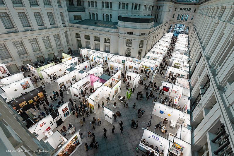
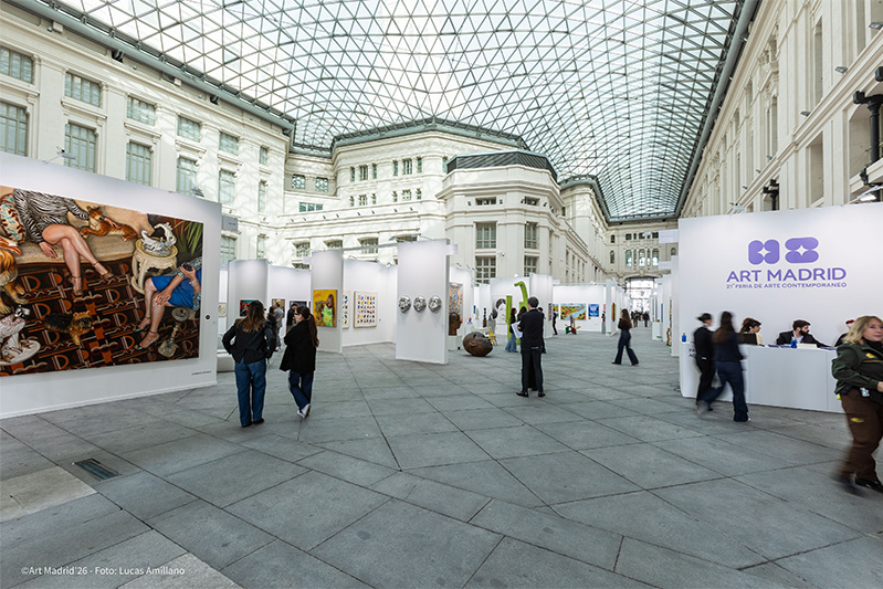
art madrid
Once again, Liquitex, the world's leading brand in professional acrylics, joins Art Madrid as a sponsor, supporting contemporary creation through a prize, which will be awarded to one of the artists participating in the fair who works with acrylics in their pieces. The prize will be awarded on 23 February at 18:00 pm will be worth 1,000 euros in Liquitex products.
The history of Liquitex begins with Henry Levison, a colour chemist who ran a company in the USA called Permanent Pigments, which manufactured oil colours for artists from 1933. The acrylics that were first developed in the early 20th century were solvent-based colour compounds. In 1955, Henry perfected the formula with a water-based acrylic that was commercially viable. This was the first acrylic gesso, called Liquitex, a perfect combination of liquid and texture.
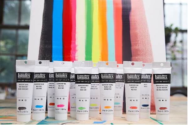
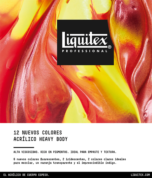
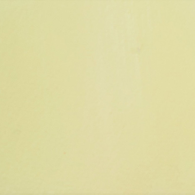
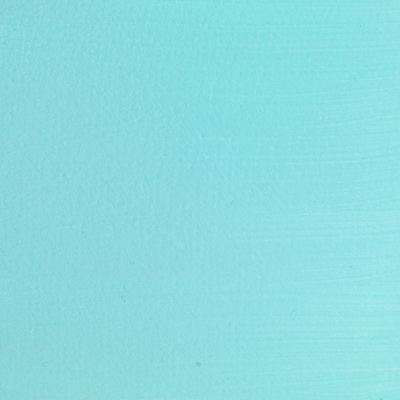
Here are some of the 12 new colours in the Heavy Body range:
LIGHT BISMUTH YELLOW A toned-down version of the iconic Bismuth Yellow, well known in watercolour technique, excellent for blending and highlighting.
LIGHT PHTHALOCYANINE GREEN A strong, vivid and opaque colour, excellent for blending natural greens, beautiful greys and pastel shades.
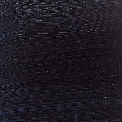
INDIGO A deep, dark midnight blue, ideal for mixing black, grey, green and purple tints.
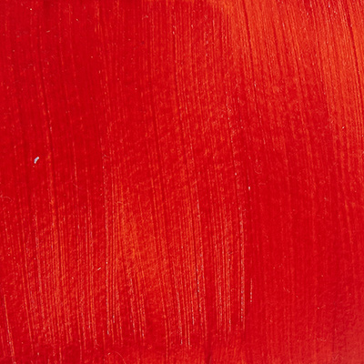
TRANSPARENT ORANGE A completely transparent orange with a deep orange-red mass tone and a yellowish tinge made from a hybrid pigment: an innovation in pigment manufacturing that combines organic and inorganic pigments.
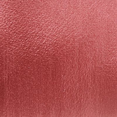
IRIDESCENT ROSE GOLD A beautiful opaque colour that reveals an iridescent sheen with hints of pink and golden tones.
Liquitex currently offers a wide range of colours in different, fully intermixable formats, as well as additives and accessories. One of its most popular ranges is Heavy Body Acrylic, its thickest bodied, high viscosity, pigment-rich acrylic. With a high concentration of lightfast, artist-quality pigments and a satin finish, Heavy Body Acrylic provides rich, permanent colour with crisp brush strokes and knife marks. It is available in a wide range of 116 colours with the recent addition of 12 new colours.