Art Madrid'24 – FERNANDO DAZA INTERVIEW, "BETWEEN THE MYSTICAL AND THE CONCRETE". NEXT TO THE GALLERY SORAYA CARTATEGUI

”My work deals with a double conceptual origin, the mystical and the concrete, and this dichotomy evolves between the spiritual search for a transcendental experience and the desire to emphasize the material presence as a concrete reality and not as an illusion”.

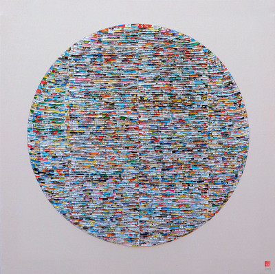
Fernando Daza (Seville, 1979), presents his latest creations in Art madrid, two diptychs and two individual works in square format, as well as some works made with medium format comic strips.

The Sevillian artist has participated in numerous individual and collective exhibitions in Madrid, Girona, Cadiz, Lisbon, Sardinia and Belgrade, and his work is present in public and private collections around the world, including the National Museum of Contemporary Art in Skopje and the National Art Gallery of Kosovo.

Fernando Daza

Círculo rojo, 2019

Paper cut by hand and glued on fabric

100 x 100cm

Fernando Daza

Círculo multicromático, 2019

Paper cut by hand and glued on fabric

100 x 100cm

Soraya Cartategui Gallery presents your work in Art for the second year in a row, what do you expect from this edition of the Fair, how do you think your work fits in Art Madrid?

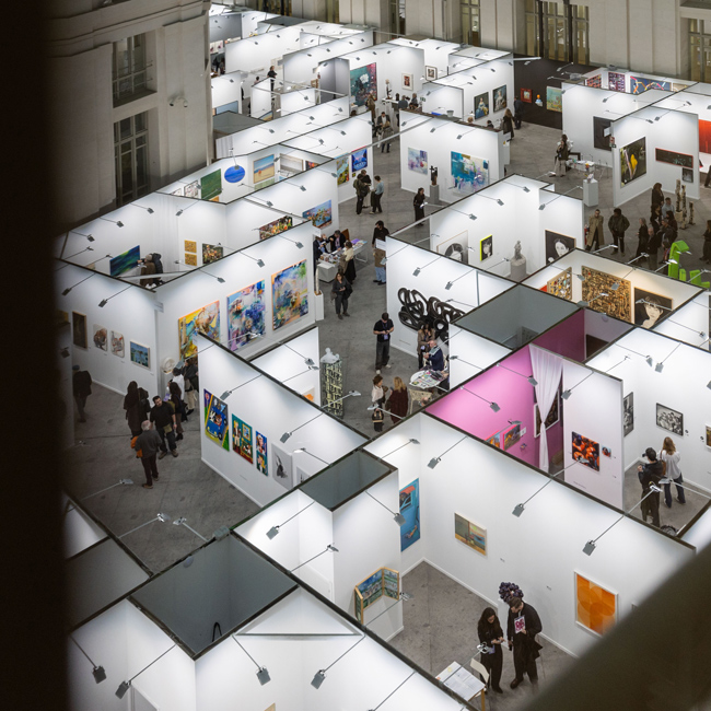
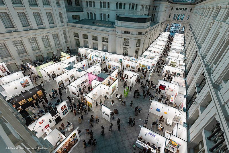
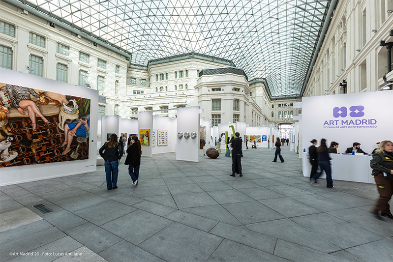
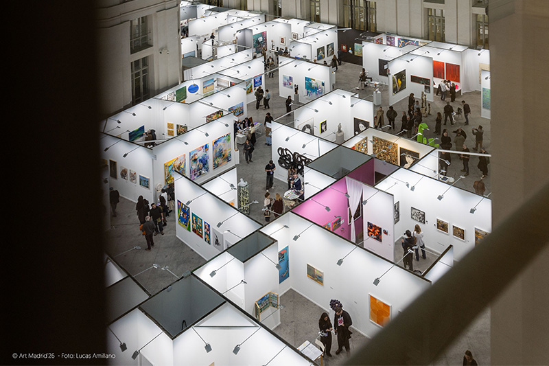
In this occasion, the fair also celebrates the fifteenth anniversary of its foundation, I hope that all the expectations of diffusion and sale of the best contemporary art will be fulfilled. This fair has always been an excellent showcase for the work of the most outstanding artists on the current national and international art scene. Of course, the scenario offered by the city of Madrid and the fabulous glass hall of the CentroCentro Cibeles building is unbeatable for hosting one of the most relevant artistic events of the year in Spain.

From the beginning, I believe that this fair has managed to preserve its open, dynamic and avant-garde character. I also believe that it is a very lively fair, with a large attendance of public and especially of collectors, with very colorful and large format works. I think that because of these characteristics my work adapts quite well to the philosophy of the fair. In fact, in the last edition, my work debuted in this fair with Soraya's gallery and was very well received. I was very satisfied with my participation and I am sure I will be for this edition.

What artworks by Fernando Daza we will see in this edition of Art Madrid?

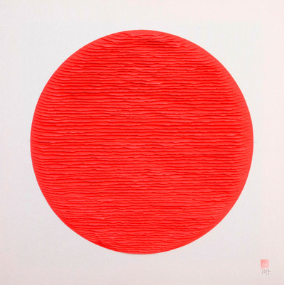
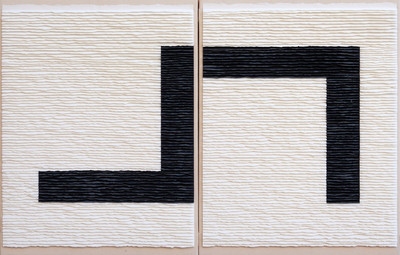
As a novelty, in this edition, I will present two diptychs and two individual works of square format. One of the diptychs is very powerful because of the oranges in the paper I have used, it is about two opposite curved forms on raw linen cloth. The other is a double composition of inverse black and white forms on a background, also inverse, in black and white. And the ones with a square support are two geometric compositions, one in the form of a cross and the other square on a background of indigo blue paper. You can also see in the stand some works made with torn comic paper in medium format, also square.

Fernando Daza

Monocromo beige 2, 2018

Paper cut with cutter and glued on wood

50 x 38cm

The delicacy with which you work the paper and the careful editing you prepare for your works is admirable, can you tell us in general terms what your method of working is, what the creative process is like before arriving at the final piece?

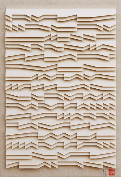
In my work, I use paper torn by hand into strips, which I later accumulate in an orderly manner and paste on the canvas, following a compositional scheme that I previously draw in pencil on the support. It is a work made in canvas on a frame, a two-dimensional support traditionally used for painting, although its character is clearly three-dimensional due to the disposition of the strips of paper; these are folded in half lengthwise and glued on the canvas on one of its sides, leaving the other side raised, slightly separated from the surface of the canvas. This method of adhering the paper to the canvas provides a raised and uneven plane. By means of a zenithal light projection, natural or artificial, we obtain a soft contrast between lights and shadows, which results in a rich and vibrant surface of visual textures. This is the most relevant formal feature of my plastic work and the distinctive feature that best characterizes it.

The origin of this creative technique came after a long period of research after I finished my degree in Fine Arts at the University of Seville. My last year of my degree I studied with an Erasmus grant at the Faculty of Fine Arts in Athens. There I started making some works with collages. The scholarship allowed us to spend the night in schools attached to the Faculty in many of the Aegean islands. We spent some time creating in these annexed schools, and since it was impossible to transport materials such as canvases, frames and paintings, I only carried a folder with papers, watercolors, inks and glue. It was here, in Greece, that my interest in collage and creation with paper began. When I returned to Spain, I wanted to continue my research in this field because I thought it was a technique that could be new compared to traditional painting techniques.

I became aware at that time of the possibilities that used paper could offer me as the main material for the creation of artworks in substitution of painting.

Fernando Daza

At that time, after finishing my studies in Fine Arts, my two older brothers, lawyers, inherited an agency that was owned by my father. One day I went to help them throw away a pile of boxes full of papers and old documents and I realized at that moment that I could use those papers for my creations. I took the boxes home and began a period of research over several years from which I obtained very fruitful results. I found several ways to accumulate the paper and create three-dimensional compositions. As time went by, I bought coloured drawing and engraving papers.

In general, your works are monochrome or bichrome, does this simplification of color have any special meaning?

My work has a double conceptual origin, the mystical and the concrete, and this dichotomy evolves between the spiritual search for a transcendental experience and the desire to emphasize the material presence as a concrete reality and not as an illusion. My compositions basically suggest approaches of suprematist origin; the search for pure sensibility through the predominance of nothingness and the representation of a universe without objects; orthogonal abstract structures, fundamental geometrical forms such as the square and the circle or simply monochrome backgrounds lacking figures. In this way, I intend to show states of maximum order with the minimum means and minimum complexity of elements and to pay more attention to the whole work than to the relationships between the singular parts.

Due to its apparent simplicity, I believe that my work hides an enigmatic presence that seems to resist interpretation and transmits spatiality and idealism to the viewer. The finishes and the material play a fundamental role in the search for balance and beauty, always in accordance with the moderation and placidity transmitted by the canvas of the support; of cotton or linen, raw and without primer. In the works where I use two colours, the chromatic contrast provides a mixed language result where the calm and subtlety of the light colours are broken by the vigour, power and firmness of the black, yellow, red and dark grey. This idea of contrariness and complementarity between opposites or inverses in the diptych works is very interesting to me because I think it harmonizes the composition.

Fernando Daza

Estructura negra sobre fondo blanco, 2018

Díptico. Papel cortado a mano y pegado sobre tela

100 x 130cm

As an artist, what do you feel committed to?

Mainly I feel committed to the idea of making an artistic work not only coherent with my needs and creative interests, but also with the moment I have to live. In my particular case, and I think I could say that the same thing happens to all my professional colleagues, there is an impulse and a permanent need to create, which are also basic and primary, that goes back, according to my conscience, to my earliest childhood, to the very origin of the use of reason. Parallel to this need, the resistance to devote myself to other professional tasks that had nothing to do with artistic practice was born and strengthened. For this reason I have focused on following this path, despite the many difficulties encountered against me. But it's such a gratification to be able to dedicate yourself to what you believe in and love that it's worth it just for that. In this sense, I could say that the first commitment is to myself.


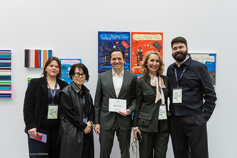
The gallery Soraya Cartategui, based in Madrid and New York, participates once again, within the general program of Art Madrid, with a selection of works from the most recent work of the artists from Seville: Isabelita Valdecasas and Fernando Daza and the Thai artist Chamnan Chongpaiboon


Antonio Ovejero

CONVERSATIONS WITH MARISOL SALANOVA. INTERVIEW PROGRAM. ART MADRID'25

Antonio Ovejero (Valencia, 1999) explores memory and the retrieval of scenes that dwell in our collective imagination, focusing on the sublime aspects of everyday life. He is fascinated by women adorned with jewelry and large bags, dresses with geometric patterns, and extravagant hairstyles that bridge different eras. Through a kitsch aesthetic, he seeks the ostentatious in attire, the conspicuous, and the pretentious, elements that are often more common and closer than one might expect.

His portraits often highlight the hands, revealing details and the objects they hold, such as a retro handbag. The use of print as an identity and aesthetic tool is a recurring element in his work. For him, the combination of age, the everyday, and elegance forms a constant image. He defines his pictorial project as a neo-pop costumbrista.

What role does experimentation play in your creative process?

I believe experimentation is crucial for any artist, as it is the means by which you discover how to represent what you wish to convey. Since I began painting, I have used various techniques to achieve the results I was looking for.

Oil painting dominates my work. I've always favored this medium because I feel more comfortable with it, and it delivers the results I want. However, when I decided to incorporate printmaking, I sought ways to present it in a more contemporary manner. Initially, I chose photographic transfer because it seemed like an interesting resource that complemented oil painting well. But I later realized I wanted the work to be entirely plastic, with painting as the dominant element. That’s when I began working with silkscreen, a printing technique that allowed for more precise results and integrated well with oil painting.

For this technique, I used acrylic paint because it dries faster and provides a greater margin for error, although it requires a lengthy process that involves more than just painting. This is when I discovered stenciling, a method where I create designs in Illustrator and then cut them out with a laser cutter. Stenciling makes the painting more organic and faster. So, I continue to search and experiment until I find the right means to complete a painting.

I believe using different techniques within one work greatly enriches it. Currently, I am focused on finding a direct way to combine brushstrokes with prints. I am experimenting with animal prints, which are more organic and forge a direct link between the painting and the act of painting itself.


Always matching bags and heels. 2024. Oil on panel. 180 x 140 cm.


What are your references?

To discuss my references, I think I need to divide them into those within my environment and those from outside. I was born into a family where my father was a painter, and my brother Miguel Ángel is also a painter, so painting has been present since my early years. Additionally, my mother always supported my dedication to the art world, and I spent a lot of time with my grandmother, who was a seamstress. Therefore, anything related to textiles, scraps, and printmaking has always caught my attention, and I have tried to capture it in my work.

As for external references, in painting, I think of artists like Marten Ant and David Storey, who work with photographic archives, or Juan Ugalde, who intervenes in photographs to create new narratives, or Gerhard Richter, whose painting is closely linked to photography. I find the union of photography and painting very interesting. I also think that my work has a strong connection with certain cinematic or photographic influences. In this respect, I highlight Martin Parr, a photographer who captures everyday scenes at the beach, focusing on details like wrinkled hands.

Another reference is Eric Persona, a Milanese photographer who explores daily life from a perspective that blends the extravagant with the mundane, creating very interesting images. I am also inspired by Thandiwe Muriu, a Kenyan photographer who creates images in which prints merge with the model, making prints a symbol of identity for Kenyan women.

As I mentioned earlier, my painting has a close connection to cinema, which is why I always think of Marisa Paredes, especially in Almodóvar’s films, where she portrays a woman with a tough life but remains elegant and sublime, something I try to reflect in the female figures I paint. In this sense, Almodóvar is an important cinematic reference. I also think my work mirrors the interplay of patterns and colors in his films. Another reference is Paolo Sorrentino, an Italian filmmaker who blends the glamorous with the everyday, the extravagant with the costumbrista, concepts I also try to incorporate into my work, just as Fellini captured a strange everydayness.

I believe all these references have a direct influence on me and help me create the imaginary I aim to represent in my work.


Your leather bag. 2024. Oil on panel. 180 x 140 cm.


How important is gesture in your portraits?

Throughout my work, I have explored portraiture from various angles, especially in the "Señoras" project, where I wanted to use the portrait as a collective stamp representing the women it portrayed, so that a figure like Conchita or Paca would symbolize all the women of that generation. I think the gesture in the portrait is very important, something I tried to emphasize in my work. Also, depending on how you portray a person, you can convey different things.

For instance, a grimace, a lascivious or defiant look, is also a form of narration within the work. But now, I use portraiture in a different way. I believe that portraying people can also be done by showing the elements that make them up. For example, I now work with close-up shots where elements such as handbags, jewelry, hands, or posture take on great significance. All of these elements also reflect what a person or a group of people is like. So, the current portrait I work on, where I use gestures, relies on the arrangement of elements: how a hand is placed, how a bag is positioned, and how the image I am portraying is constructed.


Whisky on the rocks. 2024. Oil and acrylic on panel. 40 x 40 cm.


What is your favorite format for painting?

I believe the format is crucial in how you want to create your work and how you work. I almost always work on plywood, on a frame, because the strength of the wood allows me to have more impact on the work. Also, I use printmaking techniques that require a more rigid support; if I used linen or canvas, for instance, it would loosen and make the creative process more challenging. That’s why I always work on wood.

I find it very interesting to use the brush more aggressively in the first strokes, the initial stains, which directly relate to the format. The size of the work is very important. I prefer large formats because I feel freer in that space, where the first brushstrokes and stains feel more satisfying. It also creates a connection between the painting and the act of painting itself, which I believe is essential to creation. I think pleasure has a powerful role in the work, as the result greatly depends on whether there is a certain enjoyment or if you are looking for something more perfectionist or precise.

Large formats allow me to develop best, where the work is constructed and the shapes and brushstrokes merge. When I work with smaller formats, I also enjoy the process, but it requires more consistency and thoroughness. The brushstroke has to be more precise, the focus is on a specific part, and the construction process is slower because the combination of tones is more complex.

On the other hand, in larger formats, the tones and brushstrokes come together more easily, and the form is gradually created as I work. That’s why I generally prefer large formats and plywood.


Always matching bags and heels. 2024. Oil on panel. 180 x 140 cm.


How do you think your works reflect temporality?

In my work, I always try to address themes like memory, the preservation of memory, and the passage of time. Since I began creating, this has been reflected in my first projects such as Mujeres sin color (Women without Color), Relato sobre el luto (Mourning Story), or Señoras (Ladies). I depict elderly women who lived through the post-war era and the cultural and belief systems of Spain at the time, and who, in their maturity, have somehow detached themselves from that past.

That’s why I like to represent them in a more ornate and glamorous way, as a sign of empowerment. For me, it’s important to reflect that resilience through aesthetics and print, which I use as an identity resource for a generation like that of my grandmother and her friends, who came from that harsher Spain but are still present in our society. These women, with their rings, dresses, and handbags, are the women I capture in my work.

I believe that ostentation belongs to the representation of a certain empowerment after a life in black and white, so to speak. Temporality plays a fundamental role in my work. The passage of time and how these people were treated is something I focus on a lot. I try to represent them through their objects or scenes that evoke that era, combining the experiences they have shared with me and those I have lived through, creating a whole imaginary that I seek to capture in my work, centered around these women and this society.


In collaboration with